
Paint is one of the most effective ways to give a home the welcoming, gently layered character associated with an English country cottage. The aim is not to reproduce a rigid period scheme, but to create a coordinated setting where walls, trim, furniture, and natural materials feel comfortably at home together.
A thoughtful english country cottage interior paint plan can establish visual continuity from room to room while still allowing each space to have its own purpose and personality. This guide covers palette building, color placement, trim coordination, finish choices, and practical sample testing so you can make decisions that suit your own light, furnishings, and architecture.
The Core Color Direction of an English Country Cottage Interior
English country-inspired rooms often feel relaxed because their colors are softened rather than stark or overly vivid. Warm whites, soft neutrals, muted greens, gentle blues, earthy yellows, and carefully used pink or red accents can all contribute to this look. A room does not need every one of these shades; a restrained selection is usually more convincing and more restful.
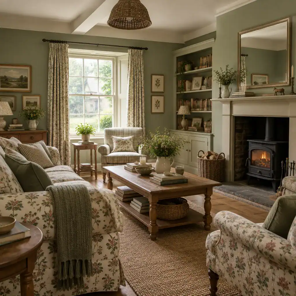
Consider low-to-moderate intensity colors as a starting point. Sage or olive-leaning green can sit easily beside aged wood, while dusty blue can cool a sunny room without feeling severe. Creamy ivory, putty, warm beige, and soft stone shades offer flexible neutral backgrounds. Butter yellow may bring gentle warmth to a dim space, and muted rose, terracotta, or deep red can work as small accents on a door, chair, cabinet interior, or textile.
Let the home itself help direct the palette. Look at visible timber, stone hearths, brickwork, flooring, garden views, patterned fabrics, inherited furniture, and artwork. A green that relates to the view outside or a neutral that echoes local stone will often feel more settled than a color chosen in isolation. You also do not need identical walls throughout the house; related undertones can create a collected flow while allowing different rooms to feel distinct.
An English country atmosphere is an interpretation of comfort, age, nature, and layering, not proof that a particular shade is historically authentic. If historical accuracy matters for a specific property, consult credible conservation, architectural, or paint-manufacturer references rather than relying on broad style labels alone.
How to Build a Cohesive Cottage Paint Palette
Start with a simple structure: choose one main wall color, one supporting neutral, and one or two controlled accent colors. This framework gives the home enough variety to feel personal while preventing every room and surface from competing for attention.
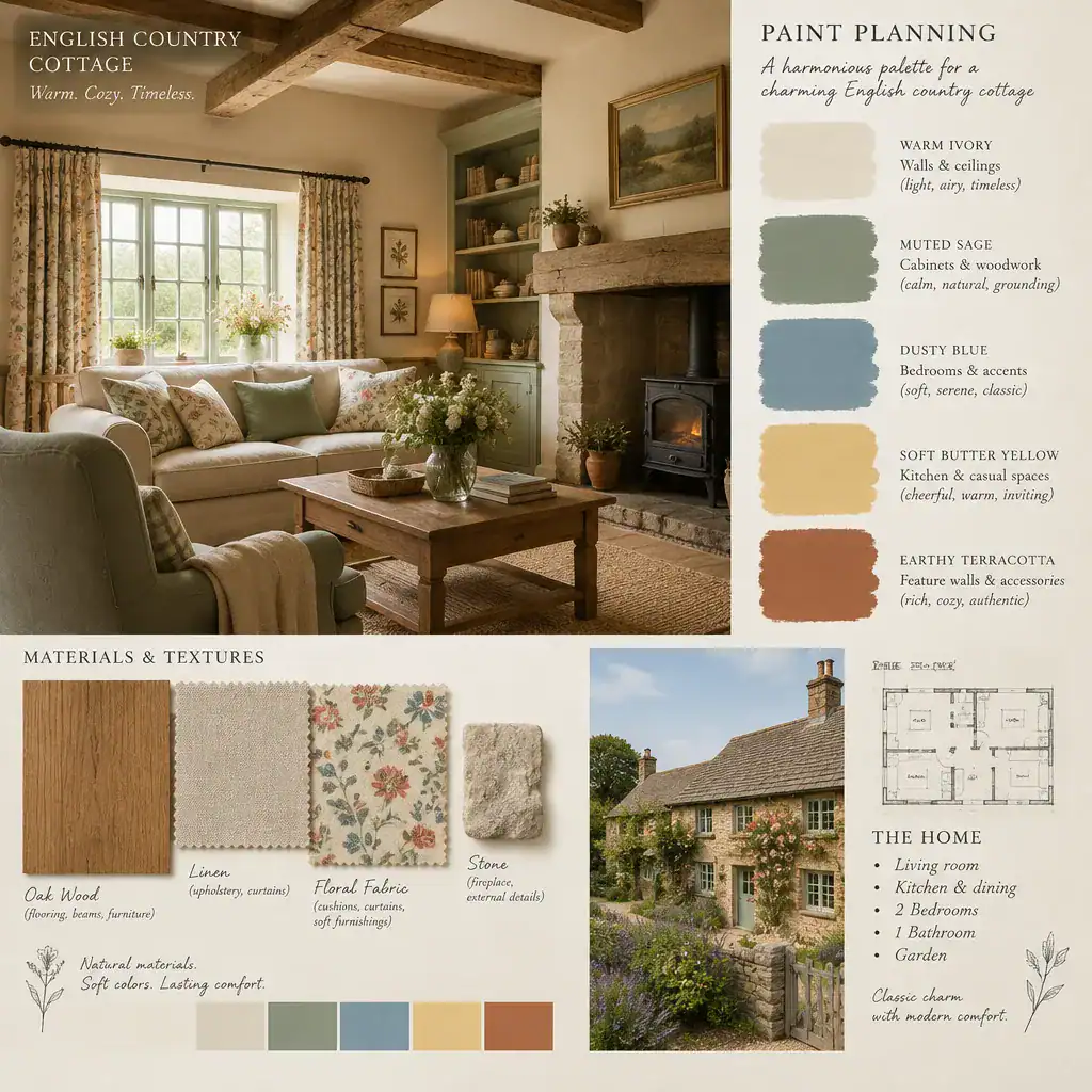
Undertones are what make this structure work. A warm white with a yellow, cream, or pink cast may complement oak, honeyed floors, and warm stone, while a cooler white can make those materials appear more orange by comparison. Likewise, a muted green with gray or yellow undertones will behave differently beside beige walls than a blue-green shade. Compare swatches directly with your flooring, cabinetry, upholstery, and trim before deciding.
For example, warm ivory trim might support muted sage walls, with dusty blue repeated in a neighboring room and terracotta appearing in cushions or pottery. The colors do not have to match exactly. Repeating a related undertone, a familiar neutral, or a small accent creates a connection that feels more natural than painting every room the same shade. This approach makes english country cottage interior paint adaptable to both compact cottages and newer homes with cottage-style details.
Test paint in the actual room rather than choosing solely from a brochure, screen, or tiny chip. Place large painted sample boards against more than one wall, then compare them beside curtains, rugs, wood, and stone at different times of day. A color that looks balanced in the store can look noticeably cooler, darker, or more saturated at home.
Applying Paint Colors Across Cottage Rooms and Features
Each room can use color differently while remaining part of the same overall plan. An entryway may benefit from a welcoming neutral, muted green, or blue-gray that introduces the palette. Living rooms often suit gentle, grounding shades that support patterned upholstery, books, artwork, and timber furniture. Bedrooms can take softer versions of the scheme, such as warm off-white, faded blue, or quiet green, to create a calm backdrop.
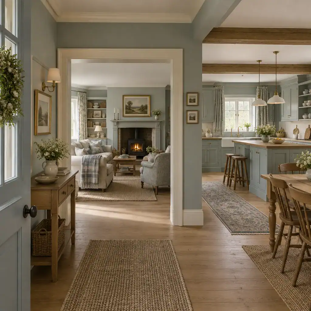
Kitchens can accommodate more practical color decisions. Painted cabinetry in an earthy green, soft blue, cream, or muted charcoal can work with natural counters and hardware, while wall colors should respond to the amount of daylight and the finish of surrounding surfaces. A home office may benefit from a subdued shade that feels composed rather than distracting. These are flexible roles, not layout rules; light and existing materials should remain the final guide.
Color placement can also shape how architectural features are perceived. Using one color across walls and selected millwork can create an enveloping, quieter effect, especially in a small room with simple details. In contrast, warm cream or ivory trim against a colored wall can highlight window casings, skirting boards, paneling, and traditional doors. Neither approach is universally better; choose based on whether you want the architecture to recede or stand out.
Ceilings, internal doors, built-ins, fireplaces, and alcoves deserve to be part of the plan rather than afterthoughts. A ceiling painted in a softened version of the wall color can make a room feel cohesive, while a pale ceiling may preserve a lighter feel. An alcove can take a deeper related color for depth, and built-in shelving may be painted to blend in or to provide a measured accent. In a successful english country cottage interior paint scheme, these decisions support the room’s furniture, daylight, and original materials rather than competing with them.
Paint Finish, Lighting, and Sample Testing for Cottage Interiors
Paint color is not fixed: it shifts with daylight direction, evening lamps, surrounding materials, sheen level, and wall texture. North-facing rooms can emphasize cooler notes, while warm afternoon light may bring out yellow, red, or green undertones. Textured plaster, aged timber, and stone also reflect light differently from smooth new drywall.
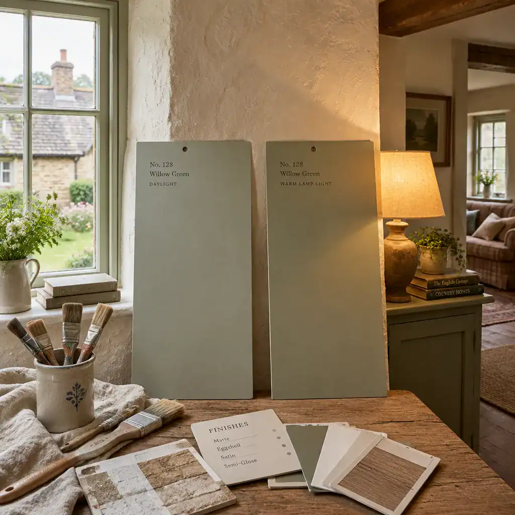
Use large sample areas or movable boards instead of relying on a small brush patch. Move boards around the room and view them in morning, afternoon, and evening light with the lamps you normally use. Testing beside curtains, cabinet doors, flooring, and upholstery is especially useful, because these neighboring colors can substantially change how a paint shade appears.
Select finishes according to the surface, the appearance you prefer, cleaning needs, and the paint manufacturer’s instructions. Lower-sheen finishes can give walls a soft, traditional appearance, but they may reveal or conceal imperfections differently depending on the product and surface. More durable, washable finishes may be useful in busy kitchens, halls, or on trim. For detailed woodwork and cabinetry, the right preparation and compatible finish matter as much as the color choice.
Assess walls before painting. Patch repairs, uneven textures, stains, and glossy old coatings can alter the final appearance or affect adhesion. Clean, repair, sand, and prime where appropriate, following product guidance. This preparation helps the finished color look intentional, particularly when using nuanced muted tones that can make surface variation more noticeable.
Common Mistakes to Avoid When Choosing Cottage Interior Paint
A common mistake is choosing a color from a small online image or screen without checking a physical sample in the intended room. Digital images are affected by photography, editing, and display settings, so use them for broad inspiration rather than final color matching.
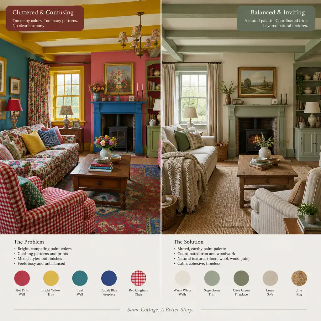
Another issue is adding too many unrelated accents. Cottage interiors can include florals, checks, woven rugs, ceramics, and collected artwork, all of which already introduce color and pattern. If wall paint, trim, cabinetry, and doors each use unrelated statement colors, the room can lose its calm, layered quality. Limit stronger accents and allow a supporting neutral to create breathing room.
Do not assume white is automatically neutral. White paint can lean creamy, pink, gray, blue, green, or yellow depending on its undertones, and it will change beside wood, stone, and wall colors. Compare candidate whites against the elements already in the room, especially if you plan to use them on trim or cabinetry.
Finally, avoid copying a reference image without adapting it to your own home. Orientation, window size, ceiling height, furnishings, architectural detailing, and existing surfaces all influence the result. Treat inspiration as a direction, then test how its ideas translate to your space. A well-planned english country cottage interior paint approach should look considered in your home, not merely familiar from a photograph.
A successful English country cottage palette feels cohesive, comfortable, and responsive to the character already present in the home. Begin by observing the light, materials, and furnishings; choose a straightforward palette structure; test real samples; coordinate trim and features; then review the colors again as the light changes. This measured process leaves room for personal taste while preserving the warm, timeless ease that makes cottage interiors inviting.