
Choosing modern ranch house exterior colors is less about finding one perfect shade and more about building a palette that works with the home already in front of you. Roof color, brick or stone, window frames, porch details, and the landscape all influence which direction will feel cohesive. A successful choice respects the ranch house’s low profile while giving its facade a cleaner, more current presence.
Because ranch homes tend to be long and horizontal, exterior color has an especially strong effect on proportion and curb appeal. This guide explores several palette directions, explains how to coordinate major facade elements, and outlines a practical testing process. Always view samples outdoors, in changing natural light, and next to the materials that will remain on the property.
What Makes a Ranch House Exterior Look Modern?
A modern ranch exterior usually relies on clear color relationships instead of a busy mix of competing tones. A restrained main color, a purposeful trim contrast, and one controlled accent often create more impact than multiple decorative colors. This approach lets the home look refreshed without losing the easy, grounded character that makes ranch architecture appealing.
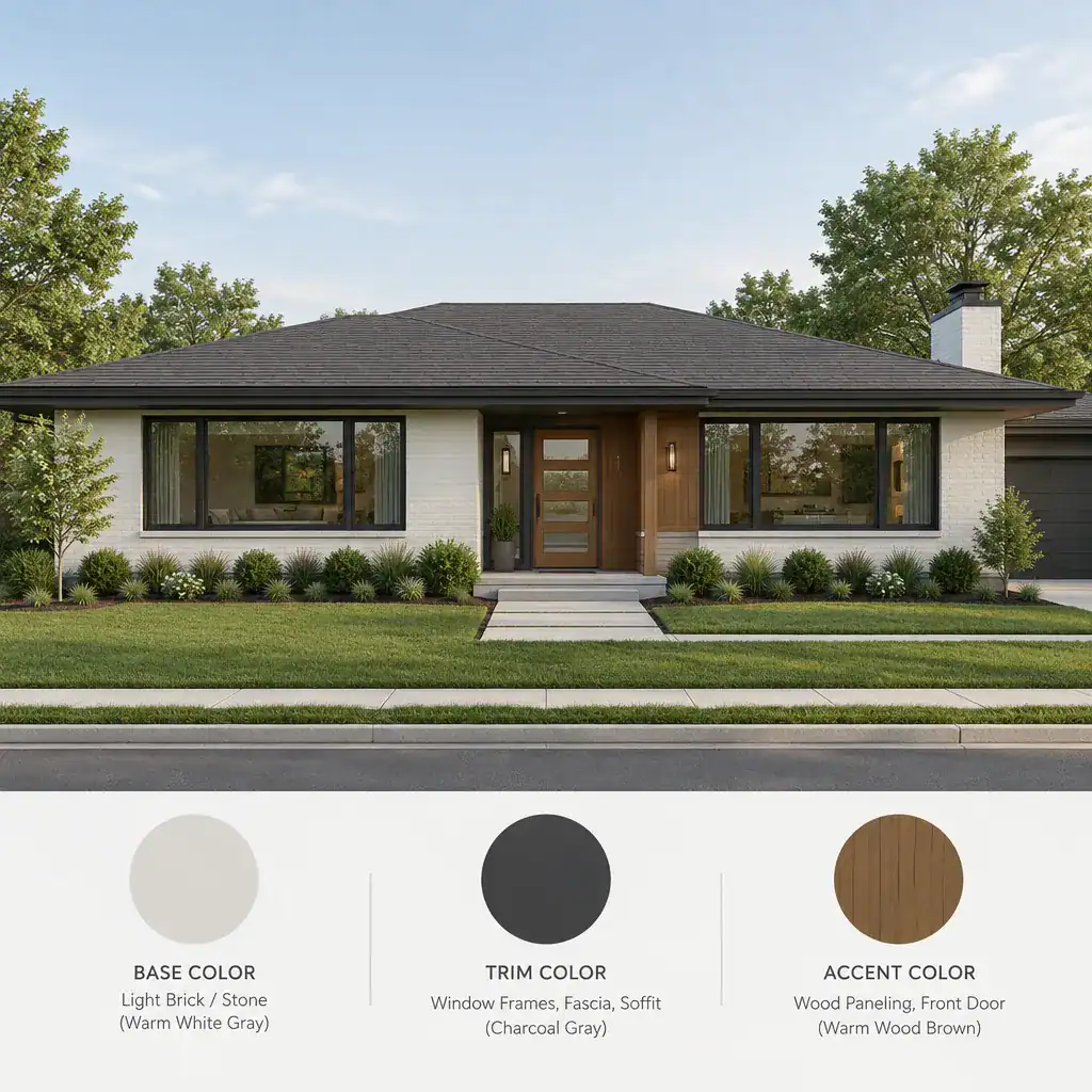
Use the base color across the largest wall surfaces, then let trim define key edges around windows, eaves, and doors. A dark trim can sharpen a pale facade, while a lighter trim can add definition to a deeper siding color. Reserve the strongest contrast for a front door, selected shutters, or a small architectural feature so the composition remains calm.
Color should reinforce the features of the house: the long roofline, broad window groupings, covered porch, and attached garage. On a low-slung facade, too many changes can visually break up the horizontal flow. Modern planning is therefore not simply choosing a currently popular paint color; it is using color deliberately to organize the facade and highlight its best proportions.
Modern Ranch House Exterior Color Palette Directions
Several palette directions can make a ranch house feel contemporary, but each creates a different mood. The right option depends on fixed materials, available daylight, and whether you want the home to stand out or settle naturally into its setting.
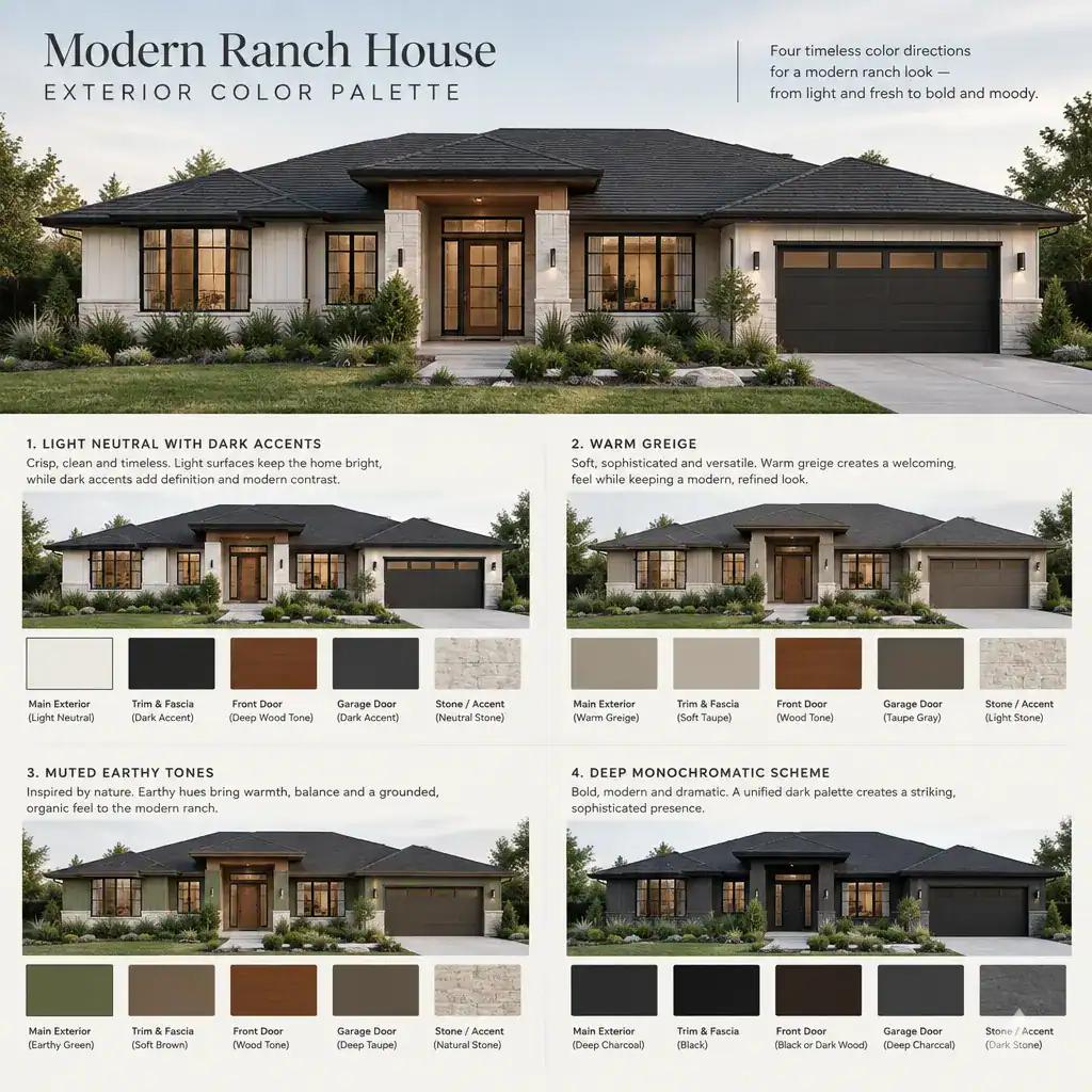
A light neutral base with charcoal, black, or deep bronze trim offers a crisp, graphic look. Soft white, pale gray, or light sand siding can make the facade appear broader and brighter, while dark window trim or a dark entry door supplies definition. This contrast works especially well when roofing or metal details already have a dark undertone.
For a softer result, consider warm white, beige, taupe, or greige. These shades can feel modern while avoiding the coolness of stark gray. Pair them with creamy trim, medium bronze fixtures, natural wood accents, or a muted dark door to create depth without an abrupt contrast.
Muted earthy colors, such as softened olive, clay, weathered blue-gray, or subdued brown, connect naturally with planting, stone, and wood. They can be especially effective on properties with mature trees or a relaxed rural character. Keep accompanying trim quiet so the main color remains believable rather than overly themed.
A deeper monochromatic approach uses related dark or mid-depth tones across siding, trim, and garage doors. For example, a charcoal-gray base may be paired with slightly lighter gray trim and black hardware. This can look refined and architectural, but it needs enough variation between surfaces to keep the exterior from reading as one flat mass. When comparing modern ranch house exterior colors, evaluate how much contrast the house needs rather than assuming a darker palette will always look more modern.
How to Coordinate Siding, Trim, Roof, and Entry Colors
Begin with the colors and materials that are difficult or expensive to change. Roofing, masonry, stone veneer, concrete paving, and existing hardscape often establish the temperature and undertone of the exterior palette. A roof with warm brown or reddish notes may work more naturally with warm greige or earthy siding, while a charcoal roof may support cooler neutrals or deeper accents.
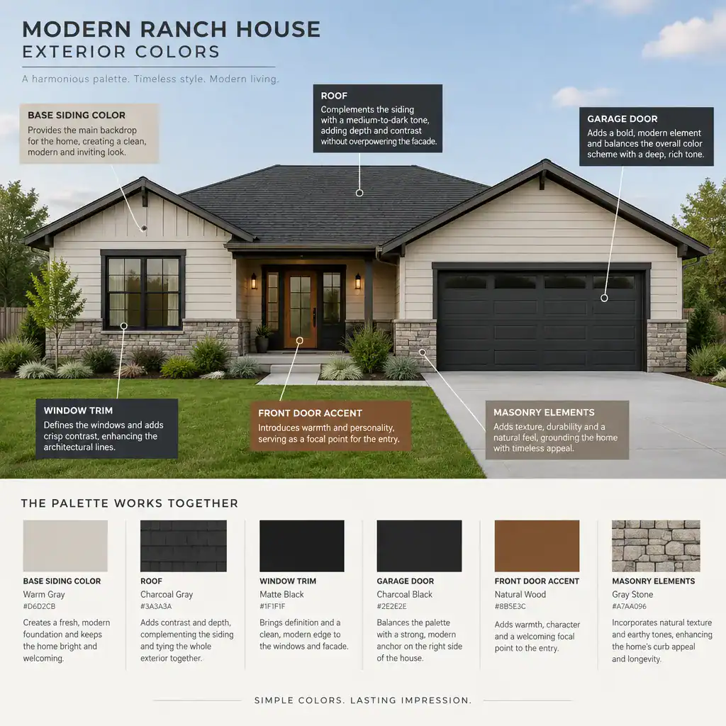
Trim is useful for clarifying transitions, but it does not need to outline every architectural detail. Focus on windows, doors, eaves, and important material changes. If every edge receives a high-contrast trim color, the facade can become fragmented and visually busy. On a simple ranch house, selective definition often looks more current.
Use the front door as a focused accent rather than an unrelated statement. A black, deep green, muted blue, warm wood, or rich clay-toned door may work when it echoes a color already present in the roof, landscaping, or masonry. The door should draw the eye toward the entry without competing with large siding or stone areas.
Garage doors deserve careful consideration because they occupy a large portion of many ranch facades. Matching them closely to the siding can reduce their visual prominence, while a trim-related color can make them feel intentional. Consider the scale of the garage before selecting a bold color for it; a dramatic shade may dominate the front elevation more than expected.
Choosing Exterior Colors for Different Ranch House Settings
The same house can call for a different palette depending on its surroundings. In wooded locations, softened greens, warm grays, taupes, and earthy browns can connect the structure to tree cover and natural stone. In an open setting, slightly clearer neutrals or stronger trim contrast may help the home retain definition against broad sky and lawn.
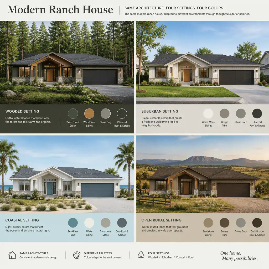
Suburban properties often benefit from looking at nearby homes, paving, fences, and established planting before finalizing a color. A palette does not need to match neighboring houses, but it should avoid clashing with permanent context. Coastal areas may suit weathered whites, sandy beiges, gentle blue-grays, or muted charcoal accents, while still taking local architecture and maintenance needs into account.
Observe each sample against landscaping, driveways, walkways, brick, and window frames. Morning sun, bright midday light, overcast conditions, and late-afternoon shade can all change the way a color appears. A gray that seems neutral in a store may look blue beside warm stone, while a beige may appear unexpectedly yellow in full sun.
Regional preferences and neighborhood guidelines also matter. Check any homeowners association rules, local historic-area requirements, or community restrictions before ordering materials. This step can narrow the choices early and prevent a palette decision from creating delays later.
A Practical Process for Testing a Modern Exterior Palette
Start by creating a small shortlist: one or two base colors, compatible trim options, and a limited selection of entry accents. This keeps the decision manageable and makes it easier to see whether the overall relationship is balanced before purchasing substantial quantities of paint, siding, or replacement doors.
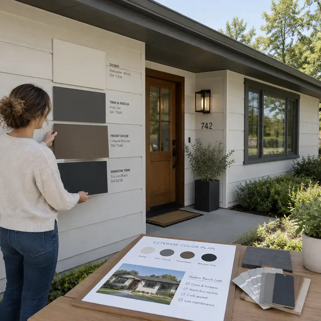
Apply generous samples near the roofline, a window, masonry or stone, and the front door. Small paint chips are helpful for eliminating obvious mismatches, but larger test areas reveal how color behaves across the siding texture and in the home’s actual light. If possible, compare the samples alongside any planned metal fixtures, wood tones, or garage-door finishes.
Review the test areas in direct sun and shade, then return at different times of day. Do not rely solely on online images or digital visualization tools, since screens cannot accurately represent every undertone or the influence of adjacent materials. This real-world review is one of the most reliable ways to narrow modern ranch house exterior colors to a confident final choice.
Before committing, confirm four practical points: the base, trim, and accent colors have a clear visual balance; the palette works with fixed materials; the finishes suit your expected maintenance routine; and the selection complies with applicable local or neighborhood restrictions. A simple final check can prevent an attractive individual color from becoming a disappointing full-facade result.
A well-planned ranch house palette coordinates the base color with the trim, roof, entry, garage, and landscape rather than treating each component separately. The most contemporary result usually comes from a balanced relationship among these elements, not from following a single prescribed shade or trend.
Use the palette direction that fits your home’s materials and setting, then test it on the actual facade before work begins. Seeing the colors in place, across changing daylight, will help you make a choice that feels cohesive and intentional for years to come.